
one set of content, three ways to explore it
My portfolio, rebuilt from a single vanilla-JS page into an Astro site with three complete themes over one source of content: an editorial grid, a metro map and a three.js floor plan. More than twenty interactive article widgets on a shared rendering library, hand-drawn animated artwork, real-time audio meters, and a test suite that keeps all of it honest.
what it is
This site started in June 2025 as one HTML file, one JavaScript file and one stylesheet. Six hundred commits later it’s a static Astro site with three complete themes, more than twenty interactive widgets inside the project write-ups, a hand-drawn illustration for every project, and a music page that shows you what a track is doing while it plays.
Everything you read here is written once. What changes is how you get to it: the classic theme you’re probably reading this in, a metro map where every page is a station, or a floor plan you walk through room by room. Each theme started as a design experiment in what a portfolio could feel like, and each one taught me something the others couldn’t. The rest of this write-up is what those experiments are, and how they hold together without turning into three websites to maintain.
three ways in
Here are the three home pages, all live now. The theme switch sits at the bottom of the classic pages; transit and blueprint have their own in their headers.
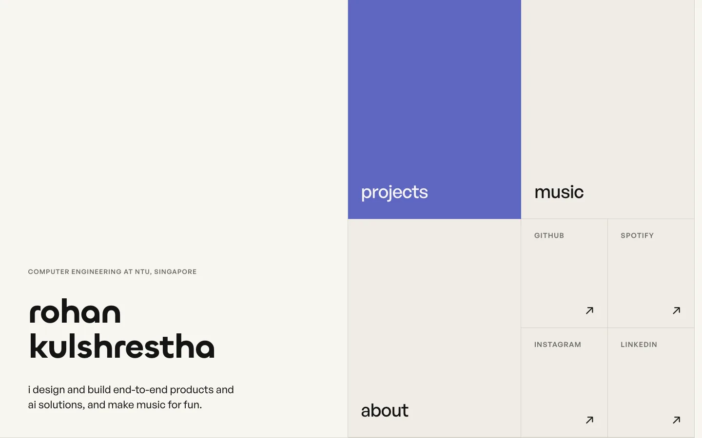
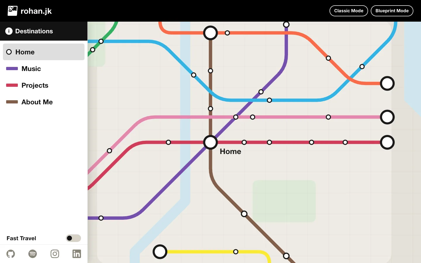
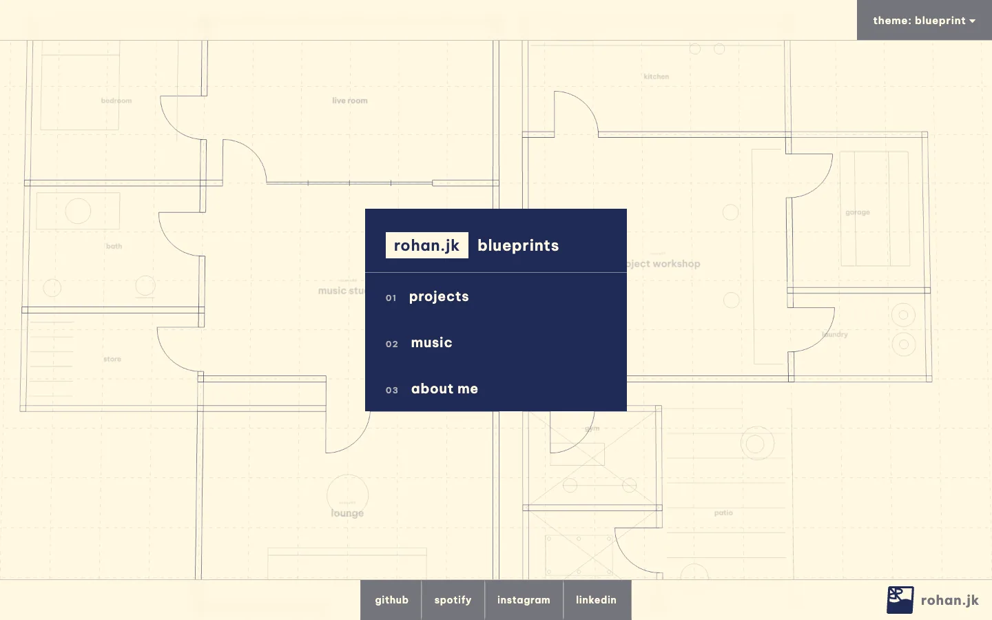
three experiments in design
Transit asks what it would be like if a website were a place you travel through. The whole site is one continuous metro map. Home, music, projects and about are coloured lines; choosing one rides the view along its track and parks at a platform, where the content appears beside the stops. Going back rides in reverse. Every move is still a real URL, so links, refreshes and the back button all work, but the page never jumps: it travels. Building it meant writing a small camera engine for a 2D map, with the motion maths kept separate from the navigation logic so each could be tested on its own.
Blueprint pushes the same idea into three dimensions. It’s a standalone three.js app drawn in a hand-drafted, hidden-line style: a floor plan of a house you enter room by room. The workshop has the project write-ups pinned to the wall as drawing sheets, the studio has a large-format mixing desk that plays the tracks, and the lounge has my bio as an A4 specification sheet on the coffee table. It’s the most indulgent of the three, and the one that taught me the most about rendering: every text surface is a canvas mapped onto a 3D plane, and making those read sharply at an angle took a checklist of resolution and filtering rules I now apply by default.
Classic is the counterweight: a quiet, typographic layout that gets out of the way. It’s built on a grid of shared-edge cells, one accent colour and two typefaces (Chillax for display, General Sans for everything else). It’s the default, and the only theme on phones, because the other two are experiences that need a desktop.
None of these were planned as a set. When I rebuilt the site in Astro in July 2026, the rebuild started as the transit map, a way to make navigation itself interesting, and the original single page stayed on as the classic theme. Blueprint followed three weeks later, from wondering how far that idea could go. The current classic design replaced the original in September, once I wanted a version where the work is the only thing on show. Keeping all three turned out to be the most useful constraint on the codebase, because anything written for one had to work for the others.
one source of truth
The rule that keeps this maintainable is that content has exactly one home. Every project article is a single Markdown file in an Astro content collection. Classic and transit render it directly. Blueprint is built with its own toolchain, so a build step copies the same files into it and generates its project list from theirs; nobody ever edits the copies. Paths line up too: /projects/bqst, /transit/projects/bqst and /blueprint/projects/bqst are the same article, and switching themes keeps you on it. Transit and blueprint are desktop experiences by design, so a phone that lands on one is sent to the same page in classic before anything heavy loads.
the widgets
Most of my project write-ups have something to play with: a drive knob that bends a saturation curve, a limit order book you step through one order at a time, a risk gate you can try to sneak an order past. There are more than twenty of them, and each has to work in all three themes.
The trick that makes that possible is splitting every widget into two layers. The drawing and the maths are pure functions: given a canvas, the data and a palette, draw the chart. They know nothing about themes. Each theme supplies only its own parts: the colours, how sharp its canvases should be (blueprint renders at double resolution because its panels sit inside a 3D scene), and where the data file lives. So the order book in the systems article is one piece of drawing code, recoloured three ways.
Because the drawing code is shared, it can be tested in a way that screenshots can’t. A recording canvas captures every drawing call a chart makes, and parity tests assert that each theme produces the same calls apart from colour. If a change makes the transit version of a chart drift from the classic one, a test fails before anyone sees it.
The older widgets, for BQST, the chord monitor and the quant research, used to carry a copy of their interaction code per theme, so every fix had to land twice. They now use the same shared modules as the newer ones, and each theme’s widget file is just wiring: about a hundred lines where there used to be more than two thousand.
the classic design
Classic uses one layout everywhere: a tinted rail down the left of every page holding its title, and a field of cells that share their edges. The accent is used only where it means something: the current page, a link, the one mark in each drawing that matters.
Every project has a hand-drawn illustration of what it does in place of a screenshot. The BQST card is the plugin’s actual control face; the careersphere one is the wireframe globe from the app. On hover each one plays a short animation: knobs turn, a chart draws in, a stamp lands. Getting those to look crisp took one non-obvious fix. When a browser animates an element’s transform or opacity, it often hands the element to the GPU as a flat texture, and when the animation ends it re-renders the vectors, so the drawing visibly softens and then snaps sharp. The answer is to animate a registered custom property instead, and derive the transform from it. The browser then redraws the vector every frame, so there’s nothing to snap back.
the music page
I produce and mix music, so the music page shows more than a play button. Each track has four live meters, fed by the Web Audio API:
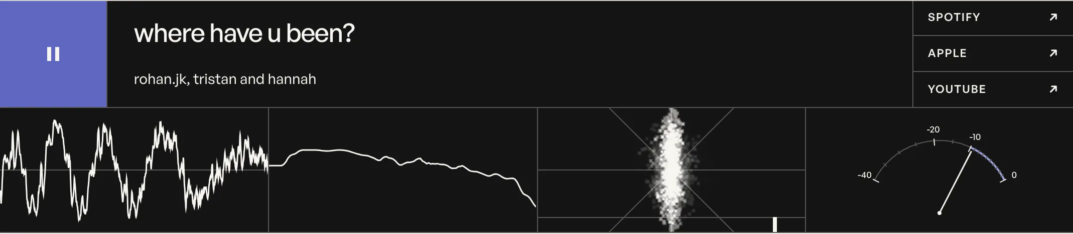
The waveform is the signal itself over the last fraction of a second. The spectrum shows where the energy sits from bass to treble. The stereo scope (a goniometer) plots left against right: a thin vertical line means mono, a wide cloud means a wide mix, and the bar underneath it is a correlation meter that swings left if the two channels start cancelling each other out. The VU meter is a loudness needle with real ballistics: the scale is non-linear so the range where music actually sits gets most of the arc, and the needle is smoothed so it moves like a physical meter instead of jittering with every frame.
testing and shipping
The site has more than 750 unit tests and nearly 180 browser tests. The unit tests cover the logic that’s easy to get subtly wrong: audio analysis, the matching engine behind the order-book widget, theme path mapping, and the chart parity checks. The browser tests drive real pages in Playwright at desktop and phone sizes: no horizontal overflow, 44-pixel touch targets, readable text sizes, the phone home fitting on one screen, reduced motion respected, themes linking to the same page.
Deploying is a GitHub Actions workflow that builds everything from a clean checkout and publishes it to GitHub Pages. Building from a clean checkout caught me out once: my working copy had an unfinished experiment in it that didn’t build, so a local build told me nothing about what production would do. Now every release is verified from a fresh copy of the branch first, the same way the deploy sees it.
A lot of this site was built with AI coding agents, and the way I use them has changed a lot since the first version. I now work like a lead with a small team. I plan and review with Claude Code, and hand self-contained jobs (a mobile accessibility pass, moving a theme to new routes, a read-only audit of whether the site was ready to launch) to Codex agents running in parallel. They coordinate through Room, a tool I built so agents can see what the others are changing. The judgement stays mine: every visual call on this site went back and forth with me looking at it in a browser, and nothing ships without the tests and my own review.
what stuck with me
Define everything once. Three themes only stayed maintainable because content, drawing code and colour were each defined once from the start. The one place where that wasn’t true, the duplicated widget code, is exactly where the bugs came from.
When motion feels off, check when things update. Nearly every time something felt slightly off, the frame rate was fine. The problem was when things updated: a meter reading a clock that ticks in uneven chunks, a knob moving before its chart, a texture snapping sharp after an animation. Measuring first found each one faster than guessing would have.
Taste is a loop you have to close yourself. The agents made building fast. Knowing that a fade was a little laggy, or that a periwinkle square was in the wrong cell, still came from looking at it and caring.